

At RRA, we span both sides of the statistics fence. We have the practical experience to know what the right rate should look like, and the academic training to calculate it.
Our charts provide you the data you need to become a rail pricing artist. Each set of charts gives you a complete view of the marketplace from two different perspectives: a National view and a Local view.
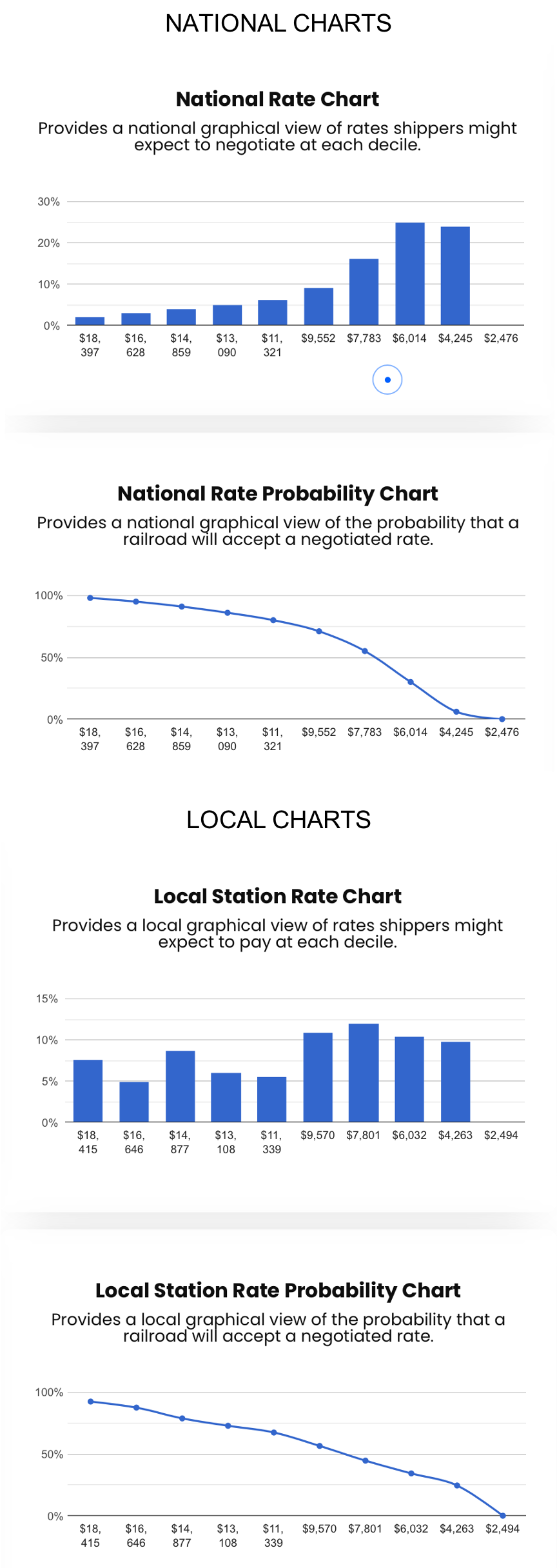
The National Rate Charts provide a nationwide view of the marketplace for shipping your commodity in its natural equipment and will generally be a normal distribution.
The Local Station Charts provide a local view of the marketplace for shipping your commodity based on local factors like demand, competition, backhauls, etc. The Local Station Charts are only available when there is significant volume already moving to the region; otherwise, the National Rate model will apply.
The Charts
The National and Local charts each consist of a Rate Chart and a Probability Chart.
The Rate Charts
The Rate Charts display a modeled distribution and probability of negotiating a rate. The National Rate Chart is often a smooth distribution with a peak near the middle. In the Local Rate Chart, the data are often spiky, representing local market power.
While the single rate we quote is mathematically accurate, B2B negotiations don’t follow the basic rules of math. Therefore, the charts provide insight to make you a pricing guru.
To interpret the charts, look at their shape. A normal distribution is symmetrical and bell-shaped. The taller and skinnier the bell, the less variation in negotiations. Short and fat bells indicate less predictability in negotiations. Lack of rate predictability is often a factor of power, and power is based on who has the best information.
Rate charts may also be skewed left or right. A chart that peaks on the right leaves a long tail to the left, indicating that some shippers pay significantly more than market rates. A chart that peaks on the left, leaving a long tail to the right, indicates that some shippers pay significantly less than market rates.
Our experience has shown that shippers who pay significantly more than market rates generally do not receive enough additional value to offset the higher rates. Shippers who pay significantly less than market rates have some leverage — whether it be volume, competition, or connections.
The Probability Charts
The probability charts provide a cumulative probability of negotiating a specific rate. The more a shipper is willing to pay, the greater the probability the railroad will accept that rate at negotiation.
For example, Plastics, from Houston, TX to Philadelphia, PA, in the national model, has a 98% chance the railroad would accept a rate of $18,397, a 71% chance they would accept a rate of $9,552, and a 30% chance they would accept a rate of $6,014.
However, on a local basis, negotiating a good rate won’t be as easy. There is a 93% chance the railroad would accept a rate of $18,214, a 73% chance they would accept a rate of $13,108, and a 34% chance they would accept a rate of $6,032.
A quick comparison of the National and Local charts shows that shipping to Philadelphia, PA, shippers tend to pay more than the national average. One last point: if shipping to Philadelphia, PA costs more than average — then shipping to some other location must cost less than average.
We stand ready to provide our services to analyze large rate data sets for bid packages, site selection, M&A, academic and governmental needs. See our plans or contact us.